Using the Graph Window
Overview
BinNavi graph windows show disassembled code in graph form. During a code analysis session you will have one or more of these windows open. Among other things you can use them to navigate through code, to annotate code, to create custom graphs, to tag interesting nodes, or to debug the target module.
You can switch graph windows between different perspectives depending on what you are working on. By default the standard perspective is active when a new graph window is opened. This perspective is primarily used for static code analysis. To debug a target process, you can switch to the so called debug perspective which offers all the functionality needed for debugging. Switching perspectives is either possible through the top menu (Window) option or through the key combination CTRL+ALT-D (debug perspective) / CTRL+ALT-S (standard perspective).
Both the standard perspective and the debug perspective divide graph
windows into roughly four parts. In both cases by far the largest part
of the graph window is the center part where the disassembled code is
shown. When the standard perspective is active, the left side of the
graph window provides a panel with different parts that make it easier
to navigate through the graph. The right side of the graph window is all
about adding information to nodes and organizing nodes. To organize
nodes you can define new node tags
there and assign them to nodes in the graph.
To add additional information to nodes and instructions you can create
new types and use the available types from the type manager to associate
them to operands of instructions. The bottom part of the graph window is a panel that contains other
useful features for analyzing disassembled code.
When the debug perspective is active, the left, right, and bottom parts
of the graph window are changed to provide useful debugging information. The left side of the window shows the current register
values while the right side shows available debugger options. The bottom
of the graph window contains tabs that show the memory of the active
process, its loaded dynamic libraries, previously recorded debug
traces, and other things.
Concepts
- Proximity Browsing: The so called Proximity Browsing mode helps you analyze large graphs. Instead of showing all the nodes and edges in the graph, only a subset of the nodes and edges are shown. Proximity Browsing works by hiding all nodes and edges which are not in the direct neighborhood of the currently selected nodes. Whenever a node selection changes, the neighborhood of the selected nodes is updated and nodes are hidden or shown depending on whether they are in that neighborhood. This ensures that only relevant nodes are shown at any given moment.
- Node Tags: Individual nodes of a graph can be tagged with so called node tags. This makes it easy to categorize different nodes into groups. Node tags can either be set and unset by manual interaction or by using one of the various methods BinNavi provides to select nodes on either behavior or location in the graph.
- Debugging: If a debugger was configured for the module that contains the view shown in the graph window, the executable on which the disassembly is based can be debugged from the graph window.
Description
The main menu
The main menu on top of the graph window provides access to many different functions. At first there is the View menu. It provides functions related to the view itself.
- View/Save View: Saves the view to the database.
- View/Save View As: Saves a copy of the view to the database.
- View/Clone View: Creates a copy of the current view and opens it.
- View/Change View Description: Shows a dialog where you can change the name and description of the view.
- View/Print View: Prints the view.
- View/Export: Saves the view to an image file (several different image formats are supported).
- View/Close View: Closes the view.
Then there is the Graph menu. The functions available from this menu are comparable to the ones from the View menu but they are connected more closely to the graph itself.
- Graph/Automatic Layouting: Enables or disables automatic layouting. If automatic layouting is enabled, the graph is layouted automatically after important changes to its structure.
- Graph/Proximity Browsing: Enables or disables proximity browsing. If proximity browsing is enabled, only the nodes in the neighborhood of the currently selected nodes are shown.
- Graph/Graph Settings: Shows a dialog where the appearance and behavior of the graph can be changed.
- Graph/Proximity Browsing Settings: Shows a dialog where the behavior of the proximity browsing mode can be changed.
- Graph/Insert View: Used to load the graph of another view into the current view.
- Graph/Delete Selected Nodes: Deletes all selected nodes from the graph.
- Graph/Delete Unselected Nodes: Deletes all unselected nodes of the graph.
- Graph/Delete Invisible Nodes: Deletes all invisible nodes from the graph.
- Graph/Transform/Inline All Functions: Inlines all functions called by the active view.
- Graph/Transform/Show REIL Code: Translates the active view to REIL code and shows the REIL graph.
- Graph/Transform/Show Dataflow graph: Shows a dataflow graph for the active view.
The next menu is the Selection menu. You can use this menu to select nodes of the graph in different ways.
- Selection/Undo Last Selection: Restores the former selection state after a selection changed.
- Selection/Redo Last Selection: Restores the last selection state after a former selection state was restored using Undo.
- Selection/Group Selection: Creates a new node group and adds the selected nodes to the group.
- Selection/Remove Selected Groups: Removes all selected node groups.
- Selection/Open/Close Selected Groups: Toggles the expansion state of all selected node groups.
- Selection/Select successors of selection: Selects all successors of the currently selected nodes.
- Selection/Select ancestors of selection: Selects all ancestors of the currently selected nodes.
- Selection/Invert selection: Selects all unselected nodes and unselects all selected nodes.
- Selection/Expand selection down: Selects the direct children of all selected nodes.
- Selection/Expand selection up: Selects the direct parents of all selected nodes.
- Selection/Expand selection: Selects the direct children and parents of all selected nodes.
- Selection/Shrink selection up: Unselects all selected nodes without incoming edges from selected nodes.
- Selection/Shrink selection down: Unselects all selected nodes without outgoing edges to selected nodes.
- Selection/Shrink selection: Unselects all selected nodes without incoming edges from selected nodes or outgoing edges to selected nodes.
- Selection/Select by Criteria: Shows a dialog where you can select nodes using more complicated criteria.
The next menu is the Search menu. In this menu the Search settings can be configured that are used by the Search field in the tool bar.
- Search/Visible Only Search: If enabled only visible nodes are considered during a search.
- Search/Selected Only Search: If enabled only selected nodes are considered during a search.
- Search/Case Sensitive Search: If enabled the search is performed case-sensitively.
- Search/Regular Expression Search: If enabled the search interprets the search string as a regular expression. The regular expression syntax used in the search field is equivalent to the Java regular expression syntax.
The next menu is the Plugins menu. You can use this menu to open a scripting dialog which you can use to manipulate the active graph. Furthermore, many plugins that work on views extend this menu to make their functionality accessible.
- Plugins/New Scripting Window: Opens a new scripting dialog that can be used to work with the current graph
- Plugins/Log Window: Opens the plugin log console window.
The last menu is the Window menu.
- Window/Standard Perspective: Switches the graph window into the standard perspective.
- Window/Debug Perspective: Switches the graph window into the debug perspective.
- Window/Show Available Hotkeys: Shows a dialog that lists the available hotkeys.
- Window/Context help: Enables context-sensitive help for the graph window.
The tool bar
Like the main menu, the tool bar is another way to quickly access many useful graph operations.

The following buttons are part of the tool bar:
- Zoom In: Zooms into the graph.
- Zoom Out: Zooms out of the graph.
- Zoom Selected: Zooms to make all selected nodes visible.
- Fit to Screen: Zooms to make the whole graph visible.
- Toggle Magnifying Mode: Switches magnifying mode on/off. In magnifying mode you can use a magnifying glass to zoom into the graph.
- Toggle Freeze Mode: Switches freeze mode on/off. If freeze mode is enabled, changes in the node selection do not trigger proximity browsing updates.
- Circular Layout: Layouts the graph in circular mode.
- Orthogonal Layout: Layouts the graph in orthogonal mode.
- Hierarchic Layout: Layouts the graph in hierarchic mode.
- Select successors of selection: Equivalent to the menu Selection/Select successors of selection
- Select ancestors of selection: Equivalent to the menu Selection/Select ancestors of selection
- Invert selection: Equivalent to the menu Selection/Invert selection
- Select by Criteria: Equivalent to the menu Selection/Select by Criteria
- Delete Selected Nodes: Equivalent to the menu Graph/Delete Selected Nodes
- Delete Selected Nodes (Keep Edges): Deletes the selected nodes of the graph and connects the parents of the deleted nodes with the children of the deleted nodes.
- Change the color of selected nodes: Shows a dialog where you can change the background color of the currently selected nodes.
In addition to the buttons, the tool bar provides an address field and a search field. You can use the address field to jump to the node that contains a given address. You can use the search field to search through the graph. The exact behavior of the search can be configured through the Search menu.
To search for a search string, you can enter a string in the search field and hit Enter. The first time you hit Enter, all occurrences of the search string in the graph are highlighted. Consecutive hits of the Enter key show the individual hits. To go back to an earlier hit, you can use CTRL-Enter. A click on the Results button shows a list of all search results.
The Graph View
The Graph View is the central part of the graph window. This is the part where you can view and work with disassembled code. Using the left mouse button you can select one or more graph nodes. Using the right mouse button you can navigate through the graph by dragging the graph view. Depending on the current settings (see the section about Graph Settings) it is also possible to zoom or scroll the graph window with the mouse wheel.
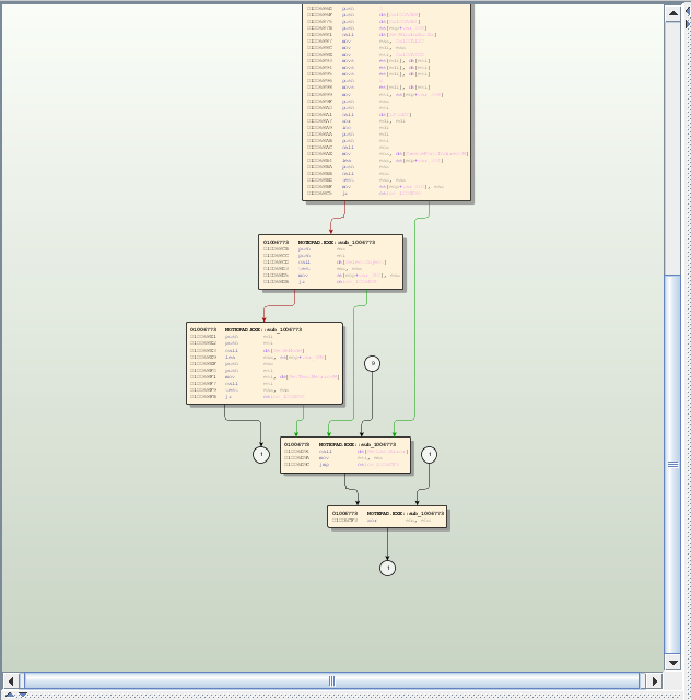
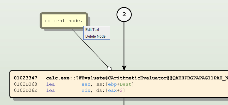
Each graph contains up to five different types of nodes. Disassembled code is shown in so called code nodes, whole functions are represented by so called function nodes, large comments can be put in comment nodes, proximity browsing nodes you navigate while proximity browsing mode is active, and group nodes let you organize your disassembly. All five types of nodes behave slightly differently and offer different options when you right-click on them to bring up a context menu. Also the menu is context aware in regards to where the cursor was located within the node when the right click was triggered such that a right click on a register yields slightly different results in the context menu then right clicking on a local variable.
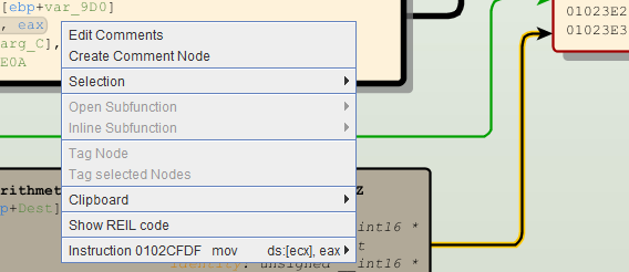
The context menu of code nodes offers the following functions:
- Edit Comments: Shows a dialog where you can edit the node and instruction comments of the code node.
- Create Comment Node: Creates a comment node that is attached to the code node. You can store larger comments in comment nodes.
- Selection/Select predecessors: Selects all predecessors of the node.
- Selection/Select successors: Selects all successors of the node.
- Selection/Select nodes from the same function: Selects all nodes that belong to the same function as the clicked node
- Open Subfunction: Opens a function in a new graph window. This option is offered for each function that is called from the code in the code node.
- Inline Subfunction: Replaces a function call in the code with the code from the called function. This option is offered for each function that is called from the code in the code node.
- Unline Subfunction: Undos are previously performed inlining operation. This operation is only available if you are clicking on an inlined node.
- Tag Node: Tags the node with the tag that is currently selected in the tag tree.
- Tag selected Nodes: Tags all selected nodes with the tag that is currently selected in the tag tree.
- Clipboard/Copy address to clipboard: Copies the address of the clicked line to the clipboard.
- Clipboard/Copy line to clipboard: Copies the clicked code line to the clipboard.
- Clipboard/Copy node to clipboard: Copies all the lines from the code node to the clipboard.
- Instruction/Toggle Breakpoint: Sets or removes a breakpoint from the clicked line.
- Instruction/Toggle Breakpoint Status: Enables or disables a breakpoint from the clicked line.
- Instruction/Add Bookmark: Adds a code bookmark to the instruction.
- Instruction/Operands: Contains various operations for working with instruction operands. You can use this menu to track the effects of registers for example.
- Instruction/Advanced/Delete Instruction: Removes the instruction from the node.
- Instruction/Advanced/Split node after instruction: Splits the node into two nodes.
- Instruction/Advanced/Show REIL code: Shows the REIL code of the node.
- Create type substitution: Opens a dialog to create a type substitution. This menu item is available when the right-click was performed with a register under the cursor.
- Edit type substitution: Opens a dialog to edit a type substitution. This menu item is available when the right-click was performed with a type substitution under the cursor.
- Delete type substitution: Deletes a type substitution. This menu item is available when the right-click was performed with a type substitution under the cursor.
Depending on what parts of the code node you click on, additional menus become available.
If you click on a numeric literal operand you can choose whether this numerical value is shown as a decimal value, a hexadecimal value, or an ASCII character value. If you click on a local variable, a global variable, or a function you can change their names. If you click on a register you can create a type substitution for the register or remove it. Also the Operands sub menu will be presented more prominently to ease the workflow for operand related operations.
Since function nodes represent whole functions their context menus necessarily look quite different.
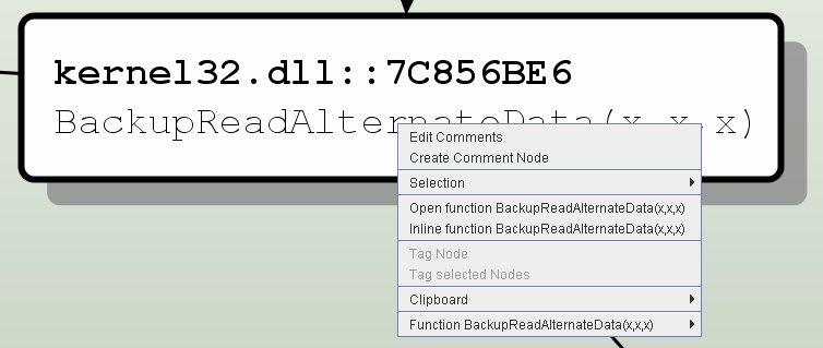
The context menu of function nodes offers nearly the same options as the context menu of code nodes. The options for breakpoints only become available when a debugger has been configured and a debug session is running.
- Edit Comments: Shows a dialog where you can edit the node and function comments of the function.
- Create Comment Node: Creates a comment node that is attached to the function node. You can store larger comments in comment nodes.
- Selection/Select predecessors: Selects all predecessors of the node.
- Selection/Select successors: Selects all successors of the node.
- Open function: Opens the function represented by the function node in a new graph window.
- Inline function: Replaces the function node by the code nodes that form the function.
- Tag Node: Tags the node with the tag that is currently selected in the tag tree.
- Tag Selected Nodes: Tags all selected nodes with the tag that is currently selected in the tag tree.
- Clipboard/Copy line to clipboard: Copies the clicked line to the clipboard.
- Clipboard/Copy node to clipboard: Copies all the lines from the function node to the clipboard.
- Function/Toggle Breakpoint: Sets or removes a breakpoint from the beginning of the function.
- Function/Toggle Breakpoint Status: Enables or disables a breakpoint at the beginning of the function.
You can use group nodes to group arbitrary sets of nodes into a single group. Since it is possible to collapse group nodes, you can replace the appearance of the nodes inside the group by a single group node that is shown in the graph. This is useful when you are doing a bottom-up style of reverse engineering where you discover more and more abstract information along the way.
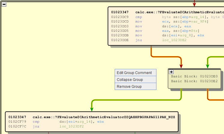
The context menu of group nodes offers the following options:
- Edit Group Comment: Edits the text that is shown when a group node is collapsed.
- Collapse Group: Collapses expanded group nodes.
- Expand Group: Expands collapsed group nodes.
- Remove Group: Removes the group node from the graph.
Comment nodes can only be deleted or have their text changed. This is reflected in the context menu that is shown when you right-click on a comment node.
Edges that connect the nodes of a graph play another important role in the graph view. Like nodes they support left-clicks and right-clicks too. When you left-click on a node, the screen is zoomed to the target of the edge. This makes it easy to quickly follow control flow paths in the graph.
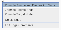
When you right-click on an edge, a context menu is shown that offers the following options:
- Zoom to Source and Destination Node: Zooms the graph to make the source and destination nodes of the edge visible.
- Zoom to Source Node: Zooms the graph to make the source node of the edge visible.
- Zoom to Destination Node: Zooms the graph to make the destination node of the edge visible.
- Delete Edge: Deletes the edge from the graph.
- Edit Edge Comments: Shows a dialog where the comment text shown on the edge can be changed.
The last of the graph nodes is the circular proximity browsing node. If proximity browsing mode is active and some graph nodes are hidden, proximity browsing nodes are attached to the visible graph nodes that give information about the number of hidden graph nodes.
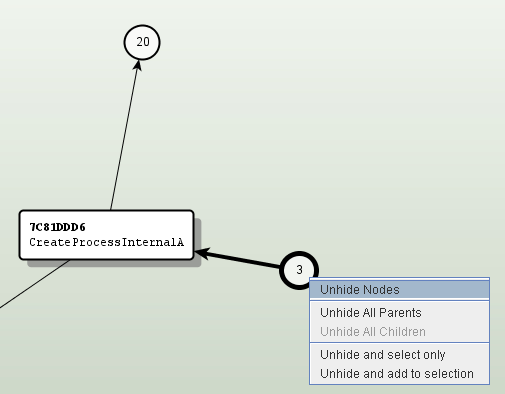
In the screenshot above two proximity browsing nodes are visible. You can see from the numbers 3 and 20 that the function CreateProcessInternalA has 20 outgoing edges and 3 incoming edges connected to nodes that are currently hidden.
Right-clicking on a proximity browsing node brings up a context menu with the following options:
- Unhide Nodes: Shows the hidden nodes.
- Unhide All Parents: Shows all invisible predecessor nodes of the node.
- Unhide All Children: Shows all invisible successor nodes of the node.
- Unhide and select only: Shows and selects the hidden nodes.
- Unhide and add to selection: Shows the hidden nodes and adds them to the current selection.
The GUI elements of the Standard Perspective
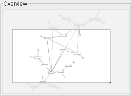
The Graph Overview
The Graph Overview is a small graph view in the upper left corner of the graph window. This overview displays a minimal version of the graph and highlights the part of the graph that is currently visible in the graph view. You can navigate through the graph by clicking on the graph overview, by dragging the mouse in the graph overview, or by using the arrow keys if the graph overview has the input focus. You can also change the visible section of the graph using the graph overview. To do so, you click on and drag the small black square in the lower right corner of the rectangle that represents the visible part of the graph.
The Graph Nodes List
The Graph Nodes List is another way to quickly navigate through the graph. This list is a small table on the left side of the graph window that lists information about each node of the graph.
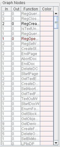
Four different pieces of information are given about each node. The first column of the table contains the number of edges ending at the node while the second column contains the number of edges starting at the node. The third column contains a small description of the node which varies depending on the type of the node. The fourth column shows the background color of the node.
Several different navigation options are available in the table. A single left-click on a row of the table changes the selection state of the corresponding node. A selected node is deselected while an unselected node is selected. A single right-click on the table centers the corresponding node on the screen while a double right-click centers the node and zooms into the graph to maximize the node.
The rows of the Graph Nodes List can have different text colors. If a row is printed in black color, the corresponding node is visible. If a row is printed in red color, the node is visible and selected. If a row is printed in gray color, the node is currently hidden by the proximity browsing mode.
The Selection History
In the lower left part of the graph window you can find the Selection History panel that contains a list of previous node selection states. Every time the selection state of a node changes, a snapshot of the selection state is made and put into the list. You can use this list to return to earlier selection states.
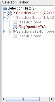
The elements of the Selection History list are either so called selection groups or simple selections. A simple selection is a selection state where just one node is selected. A selection group is a selection state where more than one node of the graph is selected. In either case it is possible to return to the whole selection state (by clicking on the Selection Group or Selection node) or to change the selection state of a single graph node (by clicking on the corresponding tree node).
Like the entries in the Graph Nodes list, the nodes of the Selection History tree change color depending on the selection state and the visibility state of the corresponding nodes. The colors used in both controls are the same with one difference. Since groups of the Selection History tree can be partly selected and partly invisible a light red color is used to denote selection groups with this state.
The Tagging Panel
The Tagging Panel on the right side of the graph window is used to create new node tags and to assign the tags to nodes of the graph.
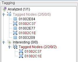
A right-click on the tagging panel brings up a context-menu that can be used to create a new Root Tag (like the tag Analyzed in the screenshot). Subsequent right-clicks on existing tags brings up a more advanced context menu with the following options.
- Add Tag to Selected Nodes: Assigns the tag to all currently selected nodes.
- Remove Tag from Selected Nodes: Removes the tag from all currently selected nodes.
- Remove Tag from all Nodes: Removes the tag from all nodes.
- Append Tag: Appends a new child-tag to the tag.
- Inserts Tag: Inserts a new child-tag between the tag and its existing child tags.
- Edit Tag Description: Shows a dialog where you can edit the name and the description of the tag.
- Delete Tag: Deletes the tag from the database.
- Delete Subtree: Deletes the tag and all of its children from the database.
For each existing tag, all nodes tagged with that tag are also shown in the Tagging tree. A right-click on the Tagged Nodes tree nodes brings up a context menu with the following options:
- Select Nodes: Selects all nodes which are part of this tag group.
- Select Visible Nodes: Selects all visible nodes which are part of this tag group.
- Select Subtree Nodes: Selects all nodes which are part of this tag group or of its children.
- Select Visible Subtree Nodes: Selects all visible nodes which are part of this tag group or of its children.
- Unselect Nodes: Deselects all nodes which are part of this tag group.
- Unselect Subtree Nodes: Deselects all nodes which are part of this tag group or of its children.
The meaning of the colors used in the tagging panel equal the ones from the selection history panel.
The Type Editor
The type editor on the right hand side of the graph window is used to work with the type system and displays all available types of the module / project of the view. The editor allows you to create / edit / delete types and assign types to registers in the graph view. Each type belongs to one of 4 categories which are represented by the following icons:
-
 :
Is the icon for compound types.
:
Is the icon for compound types. -
 :
Is the icon for array types.
:
Is the icon for array types. -
 :
Is the icon for pointer types.
:
Is the icon for pointer types. -
 :
Is the icon for atomic types.
:
Is the icon for atomic types.
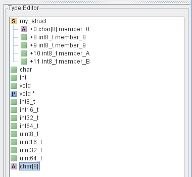
A right-click on the type editor brings up a context-menu that can be used to create a new type (like any of the types in the screenshot) when no already available type is under the cursor, or it brings up a more advanced context menu when the right-click is performed on an existing type --on the root level of the tree-- with the following options:
- Edit type: This option brings up a dialog to edit the selected type. There are 4 different context menus for each of the type categories, which are described below.
- Append member: This option brings up a dialog to append a member to a compound type.
- Delete type: This option deletes all currently selected types.
The type editor has support for drag and drop operations. This allows the user to drag a type from the type manager directly into the graph view and drop it onto a register. The register which will receive the type substitution, is highlighted while dragging the type. A type substitution is automatically created if a type is dropped onto a register and the graph is updated with the new type substitution.
Type Editor dialogs
The 4 type editor dialogs are used to create and edit types and are displayed in two different forms depending on the context of the dialog. In the case of an edit only the dialog appropriate to the type will be displayed. In the case of adding a new type all 4 type editor dialogs will be displayed in one window tabbed.
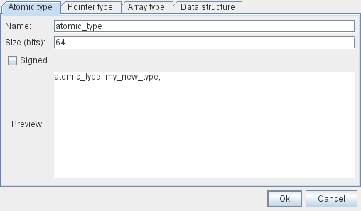
The dialog to create and edit atomic types has four different elements:
- Name: The name of the type to add / edit.
- Name: The size of the type in bits.
- Signed: A check box if checked the type is able to represent signed numbers.
- Preview: A preview of the type definition.
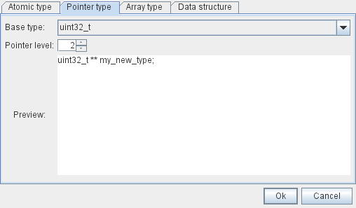
The dialog to create and edit pointer types has three different elements:
- Base type: The base type of the pointer, select integer for a pointer to an integer.
- Pointer level: The level of the pointer, select 1 for a normal pointer, 2 for a pointer to a pointer, ...
- Preview: A preview of the type definition.
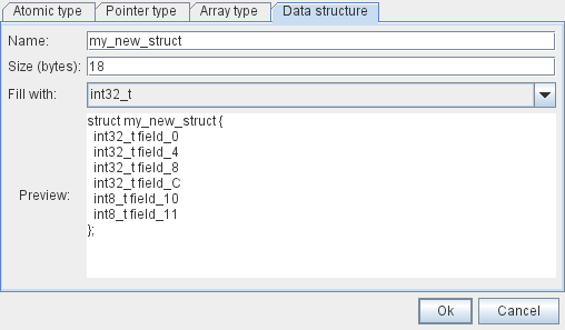
- Name: The name of the compound type.
- Size (bytes): The size of the compound type in bytes.
- Fill with: The type to initially fill the compound type with.
- Preview: A preview of the type definition.
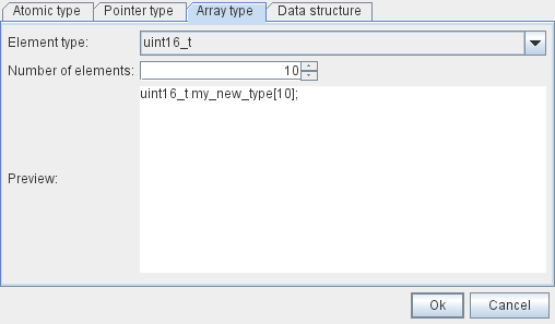
- Element type: The element type of the array, integer for an array of integers.
- Number of elements: The number of elements in the array.
- Preview: A preview of the type definition
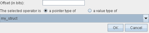
The create / edit type substitution dialog is shown on right-clicks for register operands of an instruction since these are the only elements which can have a type associated to them. The fields in the dialog are the following:
- Offset (in bits): This field is optional and is only enabled when the selected type in the combo box is a compound type, i.e. a struct. Normally you do not have to fill anything in here as the type system automatically determines the offset into the struct. But there are cases when you want to manually specify the offset into a struct and this is the field to do it.
- Operator selection radio button: Determines if the register is a pointer or a value type of the selected type.
- Type selector combo box: The type for the type substitution.
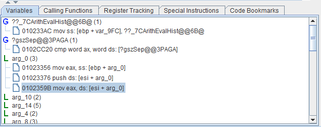
Variables
The Variables panel is the first panel shown at the bottom of the graph window in the standard perspective. This panel shows the global and local variables referenced in the currently open view. Selecting either a global or local variable in this panel highlights them in the graph. Right click on a variable allows a rename of the variable.
Calling Functions
The Calling Functions panel is the second panel shown at the bottom of the graph window in standard perspective. This panel shows a list of functions that call the functions of the active view. This means if there is a basic block that belongs to function X in the active view, all functions that calls function X are listed in the table.
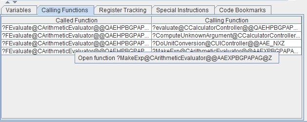
Right-clicking on the table shows a popup menu that allows you to quickly open calling functions.
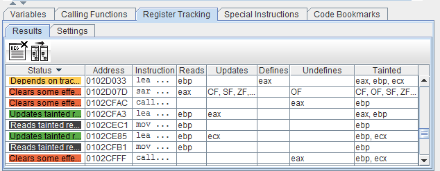
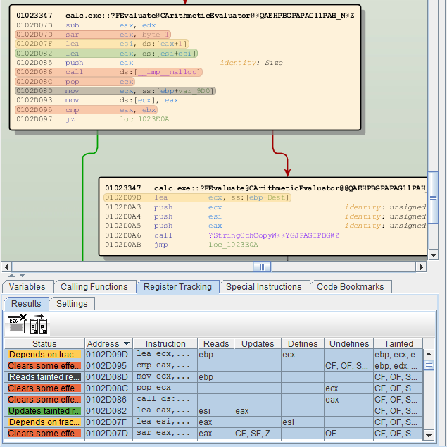
Register Tracking
The Register Tracking panel shows the results of a register tracking operation. You can track the usage of registers by right-clicking on an instruction and selecting the register you want to track through the Instructions / Operands menu. The Register Tracking algorithm then calculates and shows the registers that depend on the selected register.
The table that shows the results of the Register Tracking calculation contains the following columns:
- Status: Shows the effects of the
instruction on the tracked register.
- Start: The instruction where the tracking operation started.
- Depends on tracked register: Uses the tracked register in some way.
- Clears tracked register: The tracked register is overwritten by this instruction but some indirect effects of the tracked register are still active.
- Clears some effects: Clears some indirect effects of the tracked register.
- Clears all effects: The tracked register does not have any effects beyond this instruction.
- Updates tainted register: The tracked register is read and written in this instruction.
- Reads tainted register: The tracked register is used in a read operation which does not taint the target register.
- Address: The address of the instruction described in the row.
- Instruction: The instruction described in the row.
- Reads: Tracked registers is used by the instruction as source.
- Updates: Any register in the taint set which was in the taint set before the instruction and the instructions writes to it.
- Defines: This register is newly added to the tainted set.
- Undefines: This register is newly removed from the tainted set.
- Tainted: The current set of tainted registers.
Once Register Tracking calculated something, you can select rows of the results table to show the results directly in the main graph. By double-right-clicking on individual rows of the table, you can directly jump to individual instructions of the results table.
To clear all effects from the graph, you can click the left button of the Results toolbar. The right button creates a new graph from the register tracking results that only contains the instructions from the results table.
By default, function calls always clear all tracked effects because the algorithm assumes that function calls overwrite all registers. You can change this default behavior in the Settings tab of Register Tracking. To only clear some registers for each function call uncheck the "clears all registers" check box and supply a list of comma separated register names in the text field below.
Special Instructions
You can highlight instructions that read from the memory, write to the memory, or call subfunctions in the graph. This makes it quick and easy to get an overview of the important instructions of a function.
To highlight special instructions you use the Special Instructions panel.
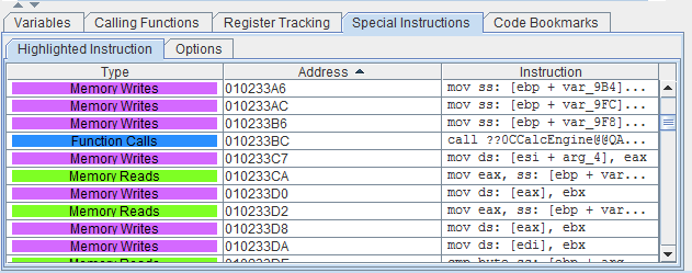
In the Options tab you can select what instructions you want to highlight in the graph and what color should be used to display them.
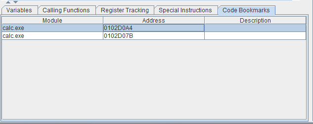
Code Bookmarks
Code bookmarks allow you to quickly navigate to known instructions in the graph. Setting a code bookmark is done through the Instruction / Add Bookmark context menu that appears when right-clicking on an instruction. Returning to a previously defined instruction is done by clicking on a row of the Code Bookmarks table.
The GUI elements of the Debug Perspective
Registers
When you are debugging a target process, its current register values are shown on the left-hand side of the graph window. Right above the registers values, the currently active debugger can be selected if more than one debugger is configured for the active view.
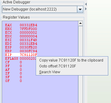
When you right-click on a register value a context menu with the following options appears:
- Copy value to the clipboard: Copies the register value to the clipboard.
- Goto offset: Shows the memory content at the location pointed to by the register value.
- Zoom to Instruction: Zooms to the instruction at the register value address. This menu is only available if there is an instruction with that address in the current view.
- Search View: Searches for views that contain the instruction at the register value address.
The Debugger Toolbar
The Debugger Toolbar provides many functions that are available for controlling execution of the the target process.

From left to right, the buttons of the debugger toolbar have the following meaning:
- Attach: Connects to the specified debug client.
- Detach: Detaches the debugger from the target process. The target process keeps running.
- Terminate: Terminates the target process.
- Step Into: Executes the next assembly instruction.
- Step Over: Executes the next assembly instruction but jumps over function calls.
- Step to next block: Executes all assembly instructions until the next basic block is reached.
- Step to end of function: Executes all assembly instructions until the end of the function is reached.
- Resume: Resumes the target process.
- Start Trace Mode: Starts trace mode.
- Stop Trace Mode: Stops trace mode.
Memory
The memory panel shows the target memory and the stack view of the active target process.
On the left-hand side you can select what memory region you want to look at. The selected memory region is then shown in the hex window on the lower left-hand side.
The Stack view is shown on the right-hand side of the panel. In this view you can take a look at the current content of the stack and the current location of the stack pointer (shown in red)
Please note that all BinNavi debuggers are remote debuggers that do not update the displayed memory and the displayed stack in real time. If you suspect that the memory content changed, you have to click on the Refresh button to reload the memory manually.
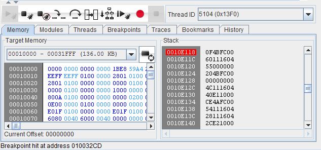
Both the memory view and the stack view provide context menus that pop on on right-clicks. These menus provide display options as well options for working with the content of the memory.
Modules
The Modules panel provides an overview of the modules that are loaded into the address space of the target process. You can use this panel to find out about the names of loaded libraries as well as their locations and sizes inside the address space.
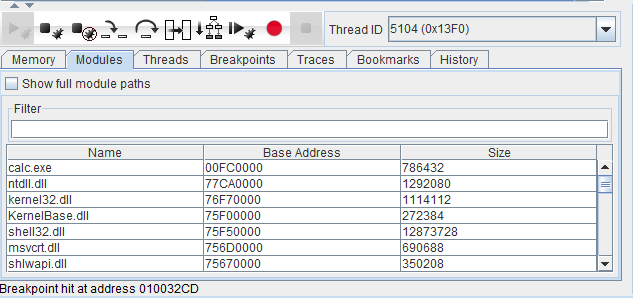
A context menu is available that allows you to quickly display a module in the memory view is available on right-click.
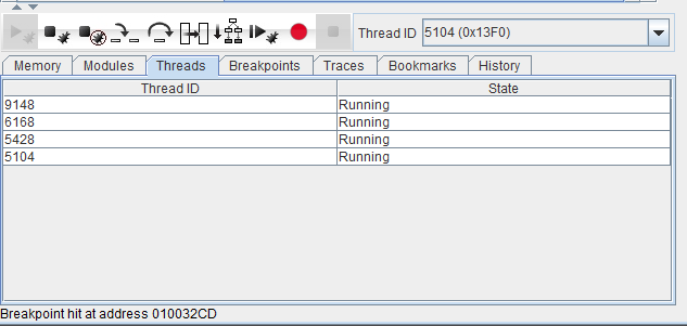
Threads
The Threads panel provides an overview of the active threads of the target process.
Breakpoints
The Breakpoints panel shows a list of all active breakpoints as well as their current state.
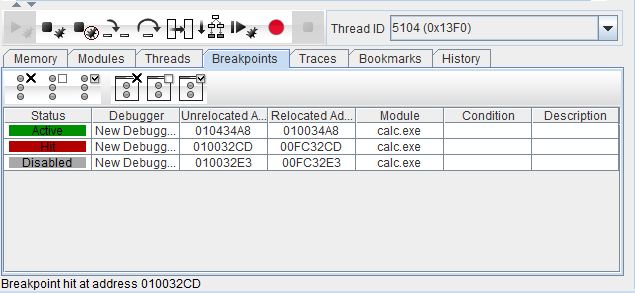
A context menu for enabling, disabling, and removing breakpoints is available on right-click. Breakpoints can also be disabled in the graph code node menu.
Traces
The Traces tab shows all previously recorded traces. The left table shows the individual trace runs. The center table shows the events of the currently selected trace run. The right table shows the individual register values and the acquired memory sections.
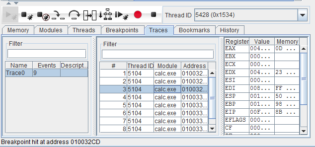
All three tables have context-menus that provide advanced options for processing the trace data.
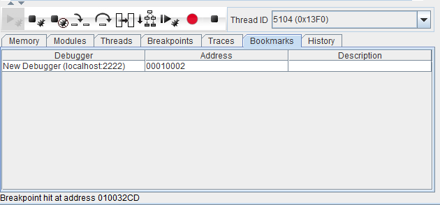
Bookmarks
The Bookmarks panel shows a list of all currently active memory bookmarks. Memory bookmarks can be used to quickly jump to an address in the memory view.
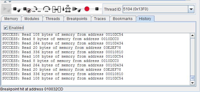
History
The history panel shows a log of the recently received debugger events. You can use this panel to get an idea about what exactly is going on in the target process.
Debugger Options
The Debugger Options panel is shown in the lower right corner of the graph window. It provides the following options:
- Show Relocated Offsets: Shows relocated offsets in the graph instead of non-relocated offsets.
- Show Options: Shows options available to the configured debugger.
For more information on using BinNavi to debug target processes, please see the section about debugging with BinNavi in this manual.
Hotkeys
Except for the hotkeys which are available through the menus and the toolbar buttons, the following hotkeys can be used in the graph window (a more complete list of available hotkeys is available through the Help/Show Available Hotkeys menu of the graph window):
- Enable node content selection: Press the mouse-wheel or press ALT and left-click into a node to set a caret into the node. Using this caret and SHIFT and the arrow keys it is possible to select the content of the node. Pressing CTRL-C copies the selected content to the clipboard.
- Copy the content of all selected nodes: Press CTRL-C to copy the content of all selected nodes to the clipboard.
- Focus the search field: Press CTRL-F to set the input focus to the search field in the tool bar.
- Focus the address field: Press CTRL-G to set the input focus to the address field in the tool bar.
- Select all visible nodes: CTRL-A selects all visible nodes of the graph
- Navigate through the graph tabs: Use CTRL-PAGEUP and CTRL-PAGEDOWN to navigate through the open graph tabs of a graph window.
- Grey out instructions: Hold CTRL-SHIFT and right-click on an assembly code line to grey out the line.
- Highlight instructions: Hold CTRL-ALT and right-click on an assembly code line to highlight the line.
- Set a breakpoint: Hold SHIFT (or CTRL) and right-click on an assembly code line to set a breakpoint on the line or to remove a breakpoint from the line.
- Toggle between zooming and scrolling: Hold CTRL and use the mouse-wheel to switch between zoom mode and scroll mode (the default behavior of the mouse wheel can be configured in the settings dialog).
- Scroll sideways: When scrolling with the mouse-wheel hold ALT to switch between top-down scrolling to right-left scrolling.
- Change the size of the magnifying glass: When magnifying mode is active, hold CTRL and use the mouse-wheel to change the size of the magnifying glass.